Have you ever noticed when looking at a web page and suddenly the content moves? Or you click a button, and the content on the page starts moving? CLS or cumulative layout shift measures this movement on a page.
Your web page didn’t finish loading, or some element changed state and caused the content to move. It’s disorientating and unsettling. It can take you & your users a few seconds to get readjusted and locate the point they were at when the page moved.
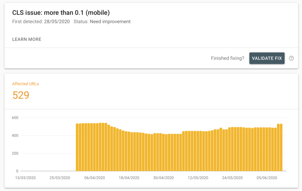
CLS might look like something like this in Google Search Console.

Once an item is displayed on a page, it shouldn’t move (accordions etc are the exception) but buttons, images and text shouldn’t move.
Common causes of a high cumulative layout shift score
The CLS score should be close to zero as you can get it. The higher the score, the bigger your problem.
A high cumulative layout shift score comes commonly from resources which are remotely loaded or embedded in the page:
- Facebook like & share buttons
- Google AdSense.
- Instagram posts
- Images
How to improve your CLS score
Improving your CLS score is done by making sure embedded items in the page have space they need to available for when they load.
The image above shows a CLS rating for The Social Golfer, I reduced this to an aggregated 0.03 (0.001 on many pages) and I made one simple tweak: I reserved the space for the adverts.
The website runs adverts via Google AdSense. The embed code for these does not have a fixed height. The height of an advert is different on mobile to desktop, so the only way to have the ads shown is to adjust when the advert loads.
I figured out at what point the advert sizes changed and then wrote some responsive CSS to set the height of the container based on what device was active at that time.
I migrated the website to SASS so the following isn’t technically CSS but it should make sense to those that understand CSS. If not, learning SASS is a great thing to do.
#ctl00_leaderboard {
	height: 50px;
	width: 320px;

	@media (min-width: 640px) {
		width: 468px;
		height: 60px;
	}

	@media (min-width: 768px) {
		height: 90px;
		width: 728px;
	}
}
The SASS code works from the smallest up using a mobile-first approach in responsiveness.
You can see the effect of this on loading a page in the gif below (loading a second page from the homepage).

Without the above SASS/CSS, you would see the title of the page move down 90px once the adverts load.
Why is this important?
In short: This is modern-day SEO! Google now measures websites in ways it didn’t five years ago. It’s currently ranking pages based on speed, contrast colours, what the user wants to do and the user experience. Keyword densities, link backs etc. are not the only factors.
Making sure that your CLS, FID, LCP/FCP are in a good range. will give you a better ranking. You’re telling Google you’re giving a better user experience.
If you’d like any advice on the below, leave a comment below or send me a message.